Craft: the word on every drinker's lips
Added: Monday, September 15th 2014

Georgie Denny and Deborah Finding from design research agency The Big Picture find out how beer drinkers define -- and choose -- craft beer.
Craft beer. It suddenly seems as though everyone is serving it, drinking it and talking about it, but that no one can pin down exactly what it is. Despite the term being bandied around by consumers and industry professionals alike, there’s no clear or accepted definition for craft beer. And given the vast range of options to choose from, beer drinkers often find themselves like kids in a sweet shop, blown away by all the brands and their bright colours, but without any idea of how to choose between them.
As a market research agency specialising in design, we were interested at The Big Picture in exploring both of these issues and what this means for the place of design in craft beer. We examined the visual landscape of craft beer, picked the brains of the trade, and ran focus groups with beer drinkers to try and find out more about the somewhat mystical world of craft beer.
Consumers told us how difficult and confusing it can be to order a craft beer without looking to the bartender for help, a difficulty that is of course heightened in the supermarket. Taking a punt on a quirky name or unusual looking bottle were both regularly cited as shaky decision-makers that often ended in disappointment.
However, we did find that beer drinkers were looking for a sense of authenticity when trying to describe – and choose – craft beer. Though authenticity means something different to everyone, there were three primary themes that emerged in our research as “hooks” helping consumers make their choice, which we called “the 3 Ps” – product, provenance, and personality.
Each of the 3 Ps can be communicated to the consumer through design, and, as you might expect, the beers that were the most successful in consumers’ minds were the brands managing to deliver against more than one of these Ps.
Firstly then: product. Beer drinkers expect an enhanced experience when ordering a craft beer over a mainstream brand. The term “craft” implies care and consideration in the brewing process, and quality ingredients, which should deliver a superior product. If a bottle can communicate at a glance that the product inside is of better quality than the bottle next to it -- without asking anyone to read the small print -- then this can be a powerful tool to help drinkers make their decision. Bermondsey-based Kernel Brewery is doing this beautifully with their current packaging. The industrial, seemingly “un-designed” style prompts associations with quality. Consumers told us that “…if the packaging is so simple they must be focusing all their time, money and effort on the beer itself.” Brands going for this deliberately undone, simple style communicate that they don’t need fancy packaging, because they are more than happy to let their beer do the talking.

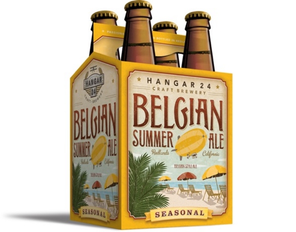
Next up: provenance. Beers using geography, history and culture to tell their brand story is nothing new, however, there is also a strong “buy local” narrative to craft beer – a sense of supporting “the little guy”, rather than giving money to a faceless corporation. There are three additional ways in which provenance can act as a hook: firstly, offering a sense of place or locality (e.g. “I am in NYC, so I will drink Brooklyn lager”); secondly, providing a reassuring brewing credibility (e.g. “Belgium is famous for beer, so I’ll choose that”), or thirdly, offering an aspirational lifestyle choice/image (e.g. “Camden is a cool place so I’ll try a beer from there.”)
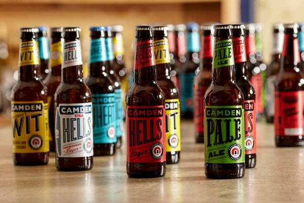
Provenance is simple to communicate through packaging as Camden Town and Brooklyn breweries show us. As well as naming the brand after its birthplace and printing the brand name in large, clear typeface, the overall design style of both speak clearly of their homelands.
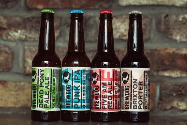
Finally: personality. Like it or not, we often buy things to say something to the world about ourselves. This manifests itself in all sorts of things from the coffee we drink (are you a Starbucks, Costa or local deli person?) to the computers we work on (Apple has done a great job in convincing us it’s virtually impossible to be creative on a PC!). Craft beer is no exception. Beers that can convey an identifiable personality through design can capture the attention of the drinker keen to project that personality. The anti-establishment naming and design of BrewDog’s offerings, and the quietly confident cool of the Einstok range clearly belong to different personas. As for Evil Twin’s Shoreditch Hipster Ale – well, that’s about as specific as it gets!
Whatever definition of craft beer gradually becomes the norm, there’s no doubt that its exponential growth shows no sign of slowing. These identity and design considerations have some interesting implications for brewers (both large and small), industry professionals, the pub, bar and restaurant trade, retailers and -- of course -- the drinkers themselves, as the craft beer category grows ever larger. We’re excited to see how this one evolves…
*To find out more about The Big Picture’s research into craft beer, contact Georgie Denny or Chris Aukett on 0207 928 1377, or for press enquiries, email Deborah Finding on [email protected]


