Can it! How branding boosts beer
Added: Thursday, December 9th 2021

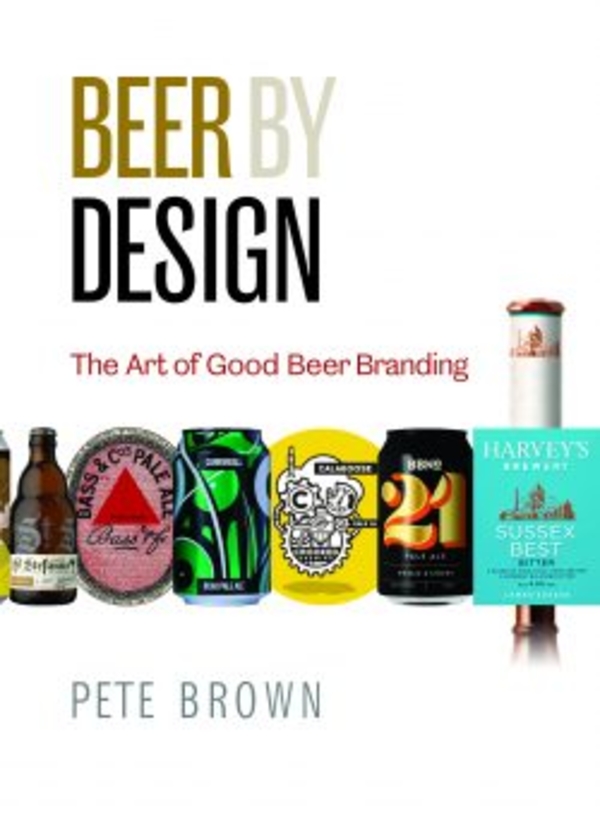
Beer by Design, Pete Brown with Liz Vater (CAMRA Books, £15.99)
I recall, in my distant youth, going into the bar of a Yorkshire hotel and finding one solitary hand pump devoid of a clip or any form of identification. When I asked which beer was being dispensed I was told it was Theakston Best Bitter and I was able to taste a fine beer from the Dales and wonder why its name was kept secret.
The world of beer has moved on since then. As Pete Brown shows in this endlessly fascinating book, marketing and branding today are major elements of a fiercely competitive beer industry. If a brewer is to achieve success, his or her beers need to stand out from the crowd. Specialist designers and public relations executives are called on to come up with eye-catching labels, pump clips and cans to catch the attention of the passing drinker.
Pete takes us back to the early days of branding in the 19th century when the first trademark legislation enabled brewers to stamp a seal on their products. First in line was mighty Bass of Burton-on-Trent with the red triangle that became an international symbol of quality as demand for Burton pale ale and IPA spread around the globe.
Hard on Bass’s heels came its local rival, Allsopps, with its red hand logo that is not too dissimilar to a triangle at first glance. Other brewers challenged the hegemony of Bass. When I was writing by Family Brewers of Britain book I was amused to discover that St Austell in Cornwall produced a beer in the 1920s called Duchy Special Pale Ale with a label depicting Cornwall in red and an almost triangular shape. The brewery also produced a beer at the time called Brown Willy, of which the less said the better.
As Pete shows, some brewers use branding to falsify their heritage. A case in point in Stella Artois, whose label states Anno 1366, which is stretching history a tad as the brewery opened in Leuven in Belgium in 1894: 1366 is the earliest evidence of brewing in the town.
Branding has exploded in the 21st century with the rise of craft beer. With thousands of beers available in Britain, it’s important to stand out from the crowd and to regularly refresh your image. This is especially true of BrewDog, Pete shows. The beer for punks had a deliberate rough, stencilled image when it burst on the scene in 2007. But now it’s a world-wide brand and recent refreshment has created a stylish and clean branding with elegant san serif type on bottles and cans.
Rebranding is not confined to metropolitan brewers. Hall & Woodhouse in rural Dorset realised that its double family name was too cumbersome for labels and pump clips and has used its old Badger logo to adorn a wide range of beers with such country names as Fursty Ferret and Hopping Hare.
Timothy Taylor in Keighley, West Yorkshire, has also refreshed its image but the huntin’, shootin’ and fishin’ Taylor family may be surprised and possibly horrified to learn that labels depicting horny handed sons of toil draw their inspiration from the propaganda posters in Russia during the Soviet period. Perhaps Taylor should add Stakhanov Stout to its range.
Modern canning has allowed designers to run riot with colourful designs that can’t be carried on a bottle label or pump clip. The most challenging designs come from Beavertown with it weird and wonderful space age cans while Five Points in Hackney prefers simple but effective bold lettering to promote its beers.
Pete Brown stresses the key role played by type faces. When I worked as a sub-editor and page designer on national newspapers I grasped the fact that serif type faces are more easily readable than san serif ones when reading newspaper columns but where headlines are concerned the two families have different roles to play. I worked on the Evening Standard and Daily Express, with their elegant serif headlines, to the brash, collar-grabbing blockbuster san serif headings of the Daily Mirror.
The two families can be found in beer labelling, with modern versions of serif proving it’s not an “old fashioned” style. A case in point is the blunt face used to promote Stone’s Arrogant Bastard Ale in California while Tennent’s red T dominates Scottish brewing. As Pete says, it hasn’t been updated in decades as it ubiquity on labels, bars and pub signs makes it unnecessary.
In New York City, another single letter – B – has made Brooklyn Brewery a stand-out member of the craft brewing movement. In sharp distinction, a clean-up of the Budweiser label, ditching decades of what Pete calls trinkets and baubles, has led to a growth in sales. You may or may not feel good about this.
The book will appeal to beer lovers and also collectors known as labologists, who will orgasm over the scores of illustrations: Liz Vater has done a remarkable job in collecting labels from all round the world. As for Theakston's in Yorkshire, they have to boldly brand their beers today as they have their neighbouring brewer, Black Sheep, not only breathing down their neck but also threatening to pierce them most painfully with the horns of the beast that adorns their labels.


